
Colori coordinati del tessuto e del filo per il ricamo
Sommario
“Stitch in Harmony: Perfectly Paired Fabric and Thread for Exquisite Embroidery”
introduzione
When it comes to embroidery, selecting the right combination of fabric and thread colors is crucial for achieving a visually appealing design. The choice of colors can greatly affect the overall aesthetic and impact of the embroidered piece. Matching fabric and thread colors requires a thoughtful approach, considering factors such as color harmony, contrast, and the intended effect of the embroidery. Whether aiming for a subtle, tone-on-tone look or a bold, contrasting design, the interplay between fabric and thread colors can either enhance or detract from the finished piece. Understanding color theory, the color wheel, and the context in which the embroidery will be displayed helps in making informed decisions for beautiful and effective results.
The Art of Color Coordination: Tips for Matching Fabric and Thread in Embroidery
Colori coordinati del tessuto e del filo per il ricamo
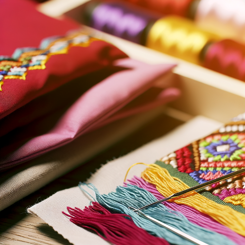
Embroidery is an art form that has been cherished for centuries, with its intricate stitches and vibrant colors bringing fabric to life. The key to creating a visually appealing embroidery piece lies in the art of color coordination. The process of matching fabric and thread colors is not merely a matter of personal preference but a deliberate choice that can enhance the overall impact of the design. This article will delve into the nuances of selecting the perfect thread colors to complement your fabric, ensuring that your embroidery projects are both beautiful and harmonious.
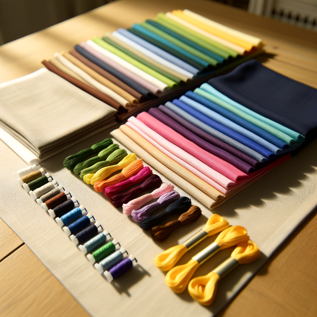
When beginning an embroidery project, the first step is to choose the fabric. The color of the fabric sets the stage for the embroidery and can greatly influence the choice of thread colors. Light-colored fabrics offer a neutral background that can accommodate a wide range of thread colors, from subtle pastels to bold hues. Conversely, dark fabrics provide a dramatic backdrop that can make bright and metallic threads stand out. It is essential to consider the fabric’s texture as well, as it can affect the visibility and interaction of the thread with the material.
Once the fabric is selected, the next step is to choose thread colors that will complement it. A fundamental tip is to use a color wheel as a guide. Colors that are opposite each other on the wheel, known as complementary colors, can create a vibrant contrast that makes the embroidery pop. For a more harmonious and soothing effect, analogous colors, which are next to each other on the wheel, can be used. These create a subtle transition from one color to the next, ideal for designs that aim for a natural or soft look.
Another aspect to consider is the value of the colors, which refers to how light or dark they are. A high contrast in value between the fabric and thread can make the design more striking and easier to see. However, if the goal is to achieve a delicate and understated effect, choosing thread colors with a similar value to the fabric can be more appropriate.
It is also important to think about the emotional and symbolic meanings of colors. For instance, red can evoke feelings of passion and energy, while blue can be calming and serene. The intended mood of the embroidery should influence the color choices, ensuring that the final piece conveys the desired sentiment.
Lighting plays a crucial role in how colors are perceived. Therefore, it is advisable to view fabric and thread under different lighting conditions before making a final decision. Natural daylight will show the truest color, while artificial lighting can alter how colors appear. This step helps to avoid any surprises once the embroidery is displayed in its intended environment.
In addition to color, the sheen of the thread can affect how it interacts with the fabric. Glossy threads can add a luxurious touch to the embroidery, while matte threads can give a more subdued and classic look. The choice between the two should align with the overall aesthetic of the project.
Finally, experimentation is a valuable part of the color-matching process. Swatches can be a helpful tool, allowing embroiderers to test different thread colors against the fabric before committing to stitching. This hands-on approach can reveal unexpected and delightful combinations that may not have been initially considered.
In conclusion, the art of matching fabric and thread colors in embroidery is a thoughtful process that requires consideration of various factors, including fabric type, color theory, value contrast, emotional resonance, lighting conditions, and thread sheen. By carefully selecting colors that complement each other, embroiderers can create pieces that are not only visually stunning but also resonate with the intended message and mood. With practice and attention to detail, anyone can master the art of color coordination in embroidery, resulting in works that are true expressions of their creative vision.
Perfect Pairings: A Guide to Selecting Complementary Thread and Fabric Colors
Colori coordinati del tessuto e del filo per il ricamo
Embroidery, the art of decorating fabric with needle and thread, is a timeless craft that allows for immense creativity and personal expression. However, the beauty of the final piece is greatly influenced by the choice of fabric and thread colors. Selecting complementary colors is not just a matter of personal taste but also an exercise in understanding color theory and the visual impact of color combinations. This guide will explore the nuances of pairing thread and fabric colors to create harmonious and visually appealing embroidery designs.
When beginning an embroidery project, the first step is to choose the fabric. The color of the fabric sets the stage for the embroidery and can either accentuate or overshadow the threadwork. Light-colored fabrics, such as whites and pastels, offer a subtle background that allows for a wide range of thread colors to stand out. Darker fabrics, on the other hand, provide a dramatic backdrop that can make bright and neon threads pop, while also offering a rich contrast for metallic and lighter-colored threads.
Once the fabric is selected, the next step is to choose the thread colors. This is where an understanding of color theory becomes invaluable. The color wheel is a helpful tool for determining which colors complement each other. Colors opposite each other on the wheel, known as complementary colors, create a vibrant contrast that is pleasing to the eye. For example, pairing a blue fabric with orange thread can result in a striking design. Analogous colors, which are next to each other on the color wheel, create a more harmonious and serene look. An embroidery piece with a green fabric and threads in shades of blue and yellow can evoke a sense of calm and continuity.
It is also important to consider the value and saturation of colors. Value refers to the lightness or darkness of a color, while saturation describes its intensity. A fabric and thread with similar values but different saturations can result in a subtle and sophisticated embroidery piece. Conversely, pairing a light fabric with a dark, saturated thread can highlight the intricacy of the stitch work and give the design a bold appearance.
Texture plays a significant role in how colors interact. A glossy thread on a matte fabric can add dimension and interest to the embroidery. Similarly, a matte thread on a shiny fabric can provide a unique visual texture that enhances the overall design. The interplay between the texture of the fabric and the sheen of the thread can transform a simple embroidery into a captivating piece of art.
In addition to color theory, personal preference and the intended use of the embroidered item should guide the selection process. For example, a piece meant to be a focal point in a room might benefit from high-contrast, vibrant colors, while an item intended to blend with existing decor might require more subdued, complementary hues.
Ultimately, the perfect pairing of fabric and thread colors in embroidery is a balance between art and science. By considering the color wheel, value, saturation, and texture, and factoring in personal taste and purpose, embroiderers can create pieces that are not only visually stunning but also resonate with their intended audience. Whether aiming for boldness or subtlety, the thoughtful selection of fabric and thread colors is a crucial step in the journey of bringing an embroidery project to life.
Mastering Monochromatic Embroidery: Techniques for Matching Shades and Tones
Colori coordinati del tessuto e del filo per il ricamo
Embroidery, the art of decorating fabric with needle and thread, has been a cherished craft for centuries. In the realm of monochromatic embroidery, the subtlety of matching shades and tones can elevate a simple design to a sophisticated work of art. Achieving harmony between fabric and thread colors requires a keen eye for detail and an understanding of color theory. This article delves into the techniques that can help embroiderers master the nuances of monochromatic embroidery.
The first step in monochromatic embroidery is selecting the right fabric. The fabric serves as the canvas for the embroidery, and its color sets the tone for the entire piece. When choosing a fabric, consider the weight and texture in addition to the color. A smooth, fine fabric will provide a different aesthetic than a coarser, textured one. The fabric’s hue should complement the thread color, creating a cohesive look that enhances the design rather than competing with it.
Once the fabric is chosen, the next challenge is selecting the thread. The key to monochromatic embroidery is not to match the fabric and thread colors exactly but to find threads that are in the same color family and offer a range of shades and tones. This subtle variation in color adds depth and dimension to the embroidery. For instance, using a slightly darker or lighter thread than the fabric can highlight the intricacies of the stitches and give the piece a dynamic quality.
Understanding the color wheel is essential when matching fabric and thread colors. Colors that are adjacent to each other on the color wheel, known as analogous colors, tend to harmonize well and are a safe choice for monochromatic embroidery. However, for a more striking effect, one might consider using complementary colors, which are opposite each other on the color wheel. This contrast can make the embroidery stand out against the fabric, but it requires a delicate balance to maintain the monochromatic theme.
Lighting plays a crucial role in color matching. Natural daylight is the best source of light for comparing colors, as artificial lighting can distort how colors appear. When matching fabric and thread, it is advisable to view them together under the same lighting conditions in which the finished piece will be displayed. This ensures that the colors will remain consistent and true to the embroiderer’s vision.
Another technique to consider is the use of variegated threads. These threads transition through a range of tones, adding a unique and organic feel to the embroidery. When using variegated threads, it is important to test them against the fabric to ensure that all the colors within the thread complement the fabric’s color.
Finally, the stitch technique can influence how the thread color interacts with the fabric. Dense stitches will show more thread color, while lighter, more open stitches will allow more of the fabric color to show through. Experimenting with different stitches and their density can help create the desired effect and ensure that the thread and fabric colors are in harmony.
In conclusion, mastering monochromatic embroidery is an exercise in precision and subtlety. By carefully selecting fabric and thread colors that complement each other, understanding color theory, considering lighting conditions, experimenting with variegated threads, and manipulating stitch techniques, embroiderers can create pieces that are both elegant and cohesive. The beauty of monochromatic embroidery lies in its simplicity and the quiet interplay of shades and tones, which, when executed skillfully, can produce a truly captivating work of art.
Conclusione
Conclusion: For successful embroidery, it is essential to carefully match fabric and thread colors. The right combination enhances the design’s visual appeal and ensures that the embroidery stands out. Consider the fabric color, texture, and pattern when selecting thread colors. Use a color wheel to find complementary or contrasting shades that will make the embroidery pop. It’s also important to consider the end use of the embroidered item and the lighting conditions in which it will be viewed, as these factors can affect color perception. Ultimately, the goal is to achieve a harmonious and aesthetically pleasing result that highlights the embroidery work.


Lascia un commento